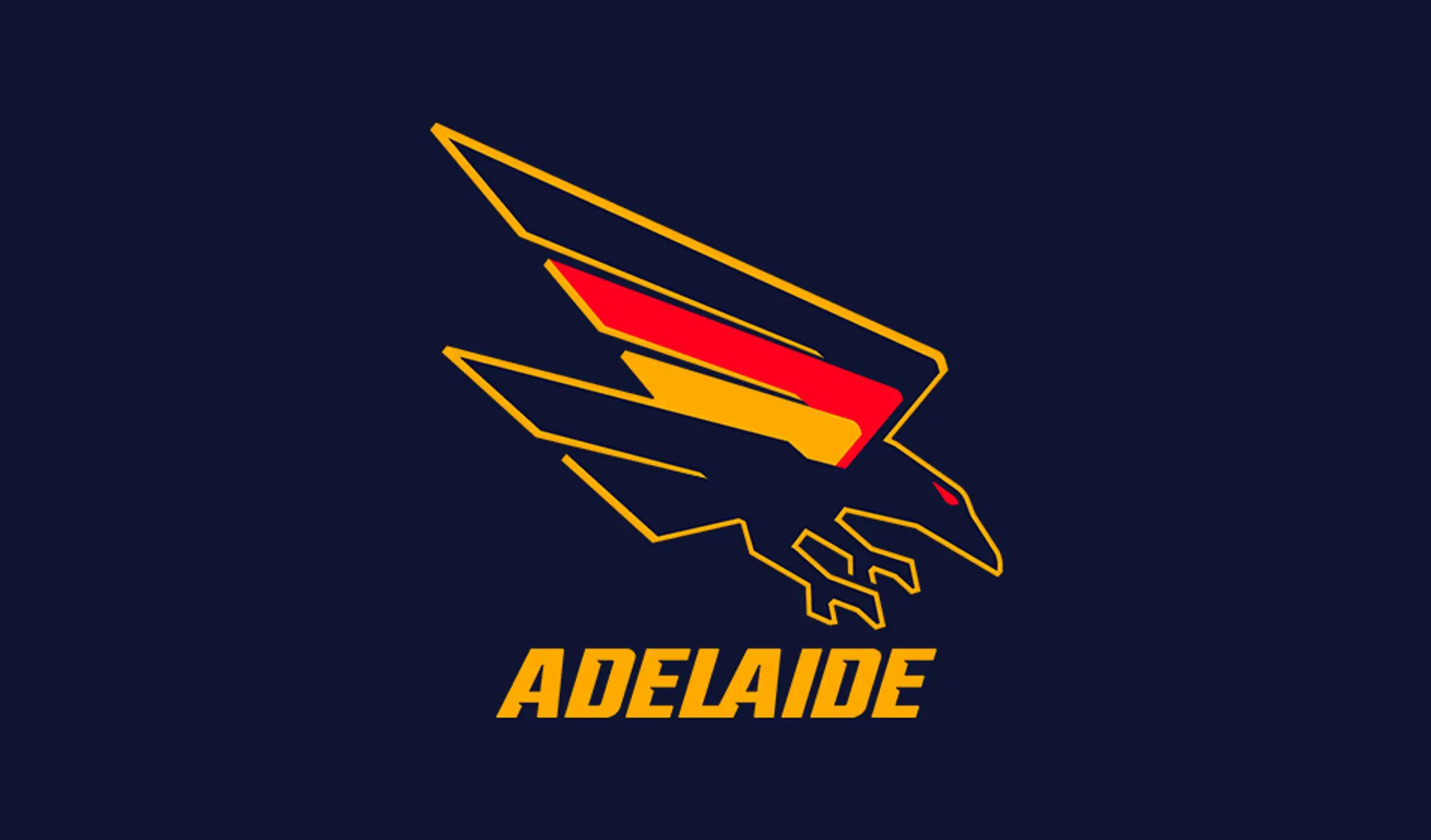
Adelaide has unveiled its new logo as the club is set to embark on a new era at the freshly minted Thebarton Oval.
The Crows' new design is a testament to the club's heritage by reverting to the original 'swooping' Crow, last seen in 2009.
The sharpened claws, beak and colour of the border provide a modern look.
It is Adelaide's latest redesign since 2010, involving consultation from key stakeholders including, but not limited to, members, supporters and South Australian agency Fuller Brand Communication.
Central to the rebrand at the Crows is the "Made from South Australia" theme, celebrating the club's football landscape and its connection since 1990.
Adelaide CEO Tim Silvers said calls for a new logo had been a constant theme in feedback from Crows members and fans since he had arrived at the club, adding the striking new design proudly represented the past and the future.
"The logo is one of the club's most recognisable features, and our supporters take great pride in it, and the throwback to the original swooping Crow reinforces our connection to this city and state by the way it now incorporates the actual shape of South Australia," Silvers said.
"We also wanted to make sure we celebrated our heritage but with a modern look and feel, which we think will resonate with our next generation of supporters. We've consulted and listened to a wide range of stakeholders, including and, most importantly, sections of our supporter base, over the past 18 months.
"Now is the perfect time to make this change as our new headquarters at Thebarton Oval is moving closer and closer to reality, so it really is the start of a new era."
Crows fans can get their hands on new-look merchandise featuring the fresh logo via the online store.


