Rebranding is an occasional occurrence in the AFL landscape, and it can provide a fresh look to storied clubs, reinvigorating the team's identity.
2024 is evidently the year of the rebrand, as Adelaide and Gold Coast have revealed bold new logos and guernsey redesigns, whilst St Kilda is anticipated to join the party, set to change their current logo that has been used for decades.
With new emblems sweeping across the nation, let's rewind back to the last time your club reimagined it's signature looks.
Adelaide - 2024
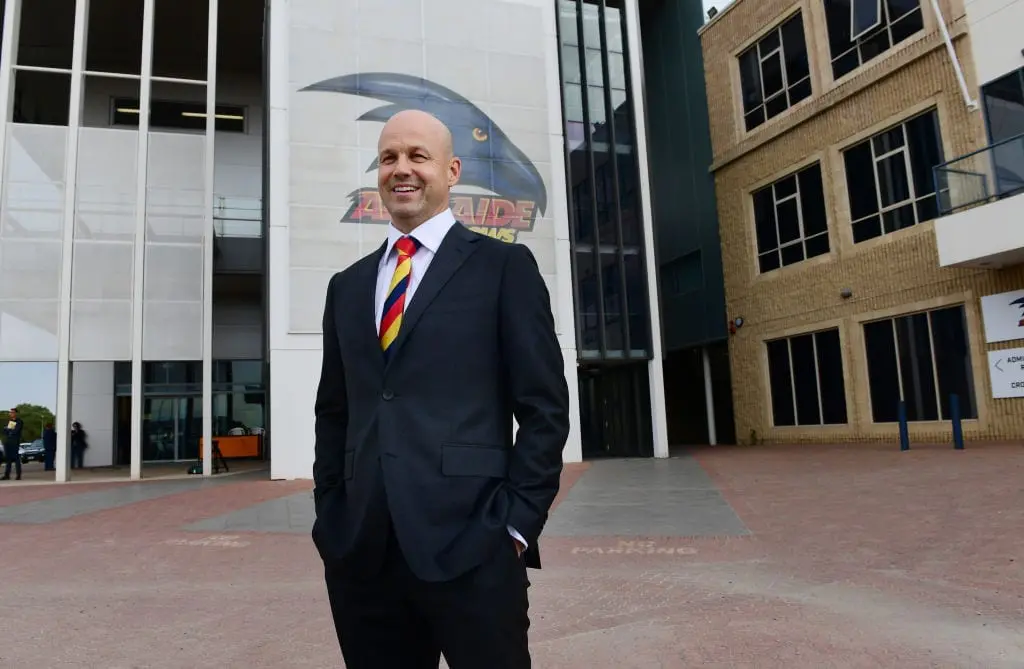
Adelaide's bold new "swooping Crow" logo was revealed just last week, modernising a familiar look that was used across the early 2000s. In a sharper, modern adjustment, the current logo has similar attributes to the logo used between 1999-2009.
A closer look at the meaning behind our new logo. pic.twitter.com/Mv61kw5jNw
— Adelaide Crows (@Adelaide_FC) November 6, 2024
The Crows' previous logo was used since 2010, featuring in multiple finals campaigns and the 2017 grand final.
Featuring a side-facing crow head and Adelaide Crows text beneath, the previous logo was the longest-running emblem in the club's history.
Brisbane - 2010
Brisbane's iconic front-facing Lions logo has been a mainstay since the turn of the 2010s decade. Ditching an oval-shaped gradient design that featured Fitzroy's side-facing Lion, Brisbane faced backlash and even a legal dispute over the logo change.
The Lions also introduced the widely-maligned 'Paddle Pop Lion' guernsey, which was quickly shafted just four seasons later, replaced by the latest jumper worn today.
However, the front-facing Lion remains as Brisbane's major logo, painted on the MCG turf when the club won its fourth premiership under the Brisbane Lions moniker in 2024.
Carlton - 2019
Carlton's logo reflects the club's monogram embossed on their guernseys, with a simple, bolded navy blue CFC. The Blues have always had the famous monogram in their logos, but none were as simplified as the current version.
Previously, the Blues logo consisted of a navy wreath-esque symbol, with a CFC monogram in thinner, white text. Along the bottom of the wreath read the Latin phrase “Mens Sana In Corpore Sano”, which is Carlton's motto meaning "a healthy mind in a healthy body". Atop the wreath is a silver football with '1864' written on the ball, the year the club was established.
This logo was used between 2013 and 2019, albeit for 2014 which replaced the Latin motto with "celebrating 150 years" in a one-off commemoratory design.
Collingwood - 2018
Following the 2017 AFL Finals, the Magpies unveiled an updated logo. Featuring the same Magpie as their previous edition, the new instalment is a simplified version of their prior logo. A blockier crest with the iconic black-and-white stripes, with a gold wreath around the lower half of the logo replaced an oval background with "Collingwood Football Club" text working its way around the border, and a thin gold wreath.
Collingwood also omitted its Australian flag from the bottom left, and its flag of black-and-white stripes moved into the background of the contemporary shield.
The previous logo was used between 2004 and 2016, with a 125-year commemoratory logo used in 2017, whilst a near identical logo was also used from 1993 - the subtle difference being the Australian flag on the right side of the logo.
Essendon - 1998
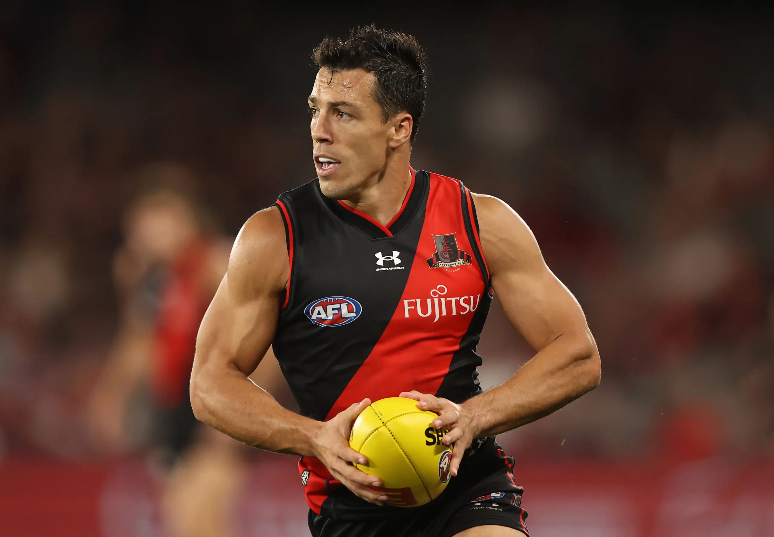
Essendon's logo has endured over two and a half decades of use, with its initial implementation before the turn of the 21st century.
The current Bombers logo replaced the classic shield emblem used by many clubs in the 20th century, with Essendon's final shield logo featuring the red sash across a black background, with a bomber plane placed over the top.
Since 1998, the Bombers have only used a different logo once, which was a commemoratory logo to celebrate 150 years in 2022.
Fremantle - 2011
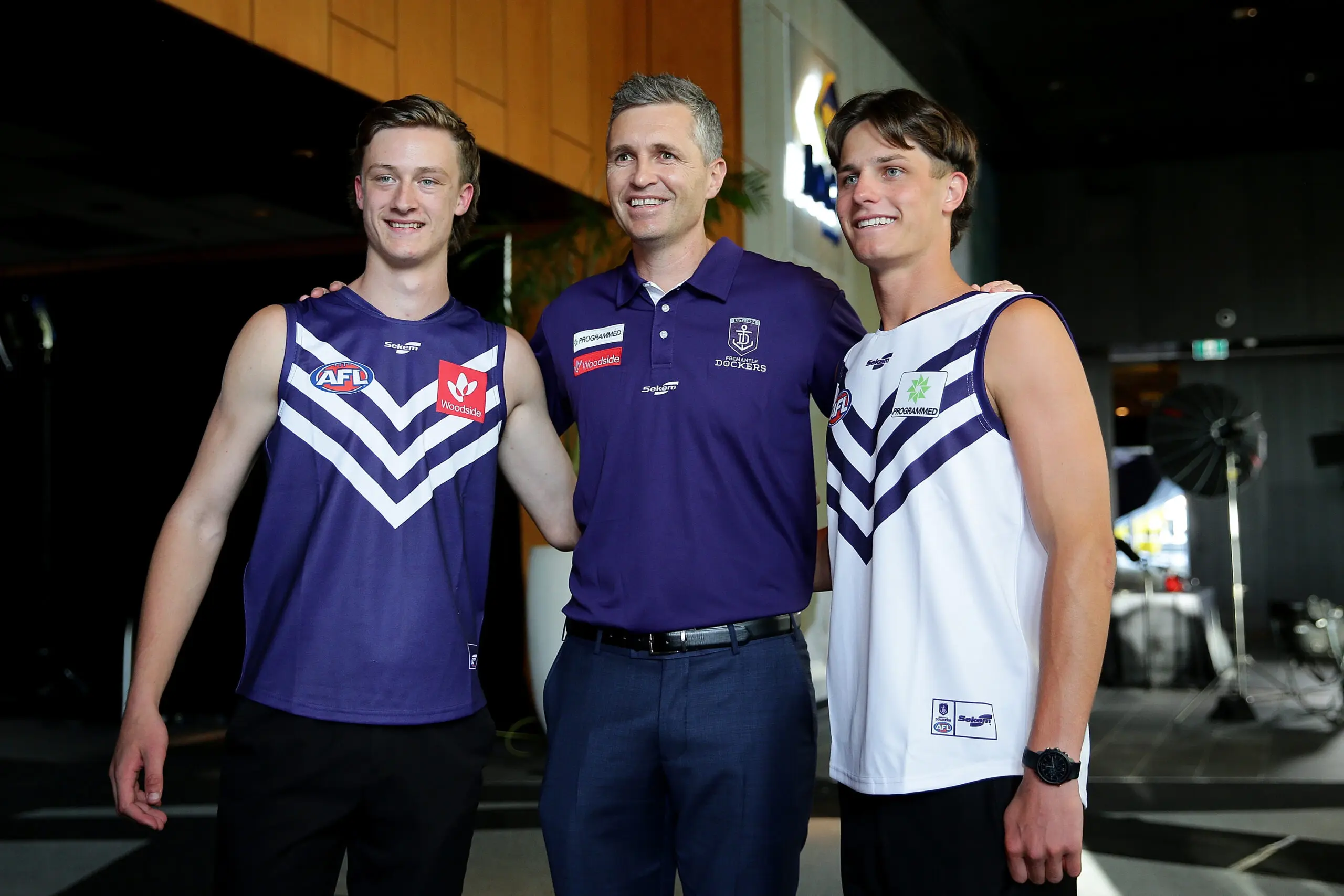
In 2011, the Dockers ditched the red and green colours of their football club, embracing purple and white as the club's look of the future. Hence, the Dockers went under a major rebrand, with an unrecognisable logo and uniform unveiled compared to years past.
The Dockers logo previously consisted of a man holding an anchor on a half-red, half-green shield, with Fremantle Football Club written underneath.
The new Dockers logo now consists of a simplified anchor symbol on a purple shield, with its establishing year of 1994 above, and 'Fremantle Dockers' text below.
The guernseys went under major renovation too. A home guernsey consisting of a white anchor that separated green, red, and purple panels was Fremantle's jumper from the club's inception, but in 2011 the guernsey changed to the present-day full purple guernsey with three white chevrons.
Geelong - 2008
In 2008, Geelong changed its logo to the current iteration featuring a front-facing cat face blending into navy blue and white hoops on a crest-shaped logo. The use of a cat image in the actual logo was the first since 1999 when Geelong utilised a full-body cat image on a shield logo similar to the aforementioned Essendon emblem of the 1990s.
Prior to today's Cats logo, Geelong used a similar crest logo with a GFC monogram in between the navy blue and white hoops, with Geelong Football Club text atop the shield.
Gold Coast Suns - 2024
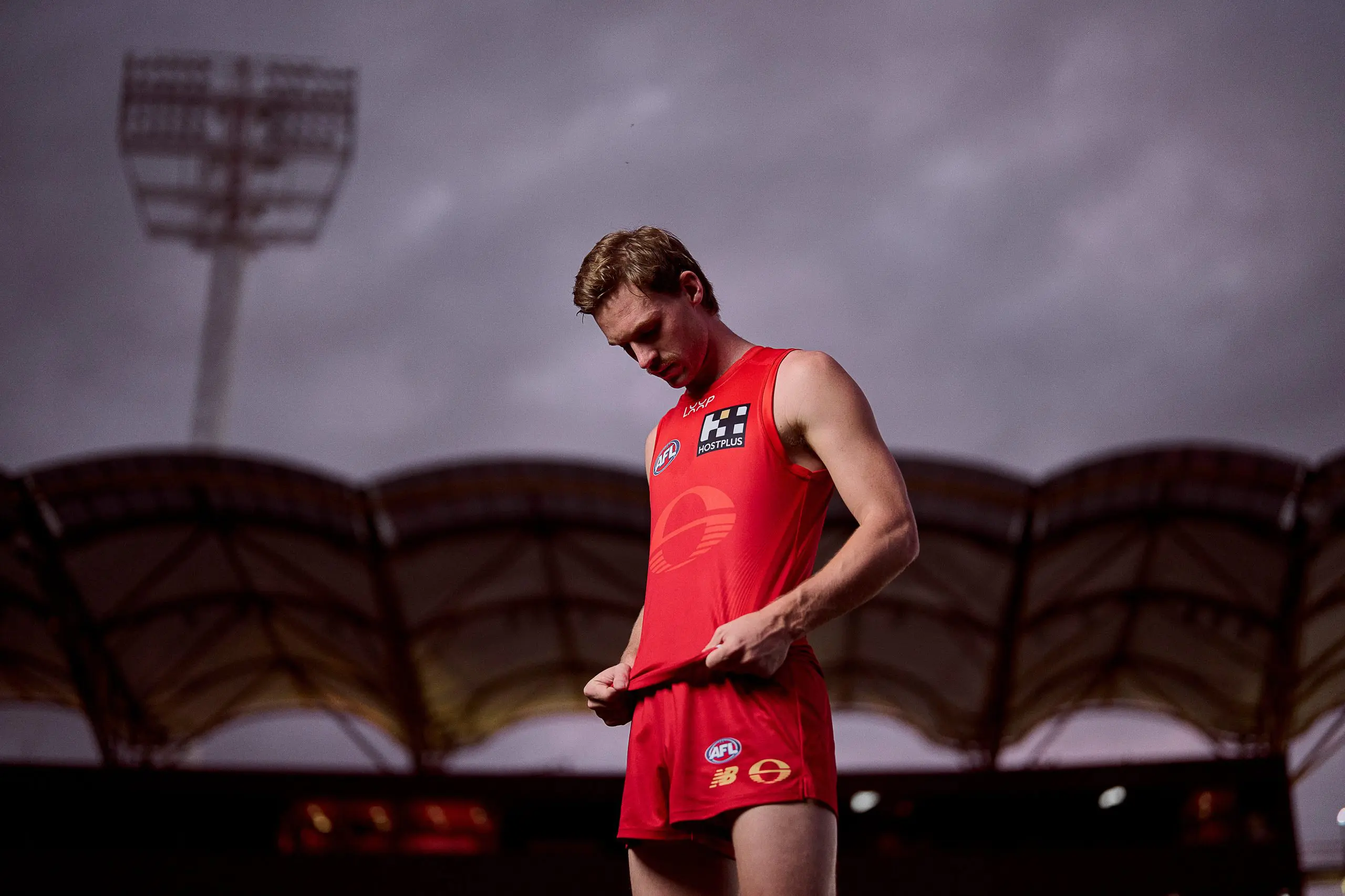
The Suns' new logo introduced this week is the first major rebranding since the club joined the league in 2011. The new logo removes any mention of the Gold Coast location, as well as the gold and blue colours typically found in its previous rendition.
Gold Coast's new guernseys are also a bold change to their previous branding, including a red-on-red home guernsey, and a predominantly gold clash kit with navy detailing. What remains the same is the oval shape of the logo, as well as its central placement on the guernsey.
GWS - 2012
The Giants have not changed their logo since their arrival to the AFL, maintaining their bold orange G with Giants text underneath.
Before GWS had become the Giants, the club played under the 'Team GWS' name and wore colours of red, white and blue between 2009 and 2011 during their appearances in the TAC Cup (now Coates Talent League) and NEAFL.
Wouldn’t say no to a Retro Jumper… https://t.co/Cmo2Sp1cyj pic.twitter.com/kWqp3woIRO
— GWS GIANTS (@GWSGIANTS) June 15, 2023
Hawthorn - 2008
Hawthorn adopted the side-eye Hawk in 2008, replacing a gold rectangular logo with a brown swooping hawk clawing onto a football. The text of 'Hawks' was kept in the current edition of the Hawthorn logo, however it moved from the bottom to the top of the emblem.
The modern Hawks logo has seen a decade and a half of success, with four premierships won during its time, whilst the previous logo failed to be worn across any grand final campaigns in its usage between 1997 and 2007.
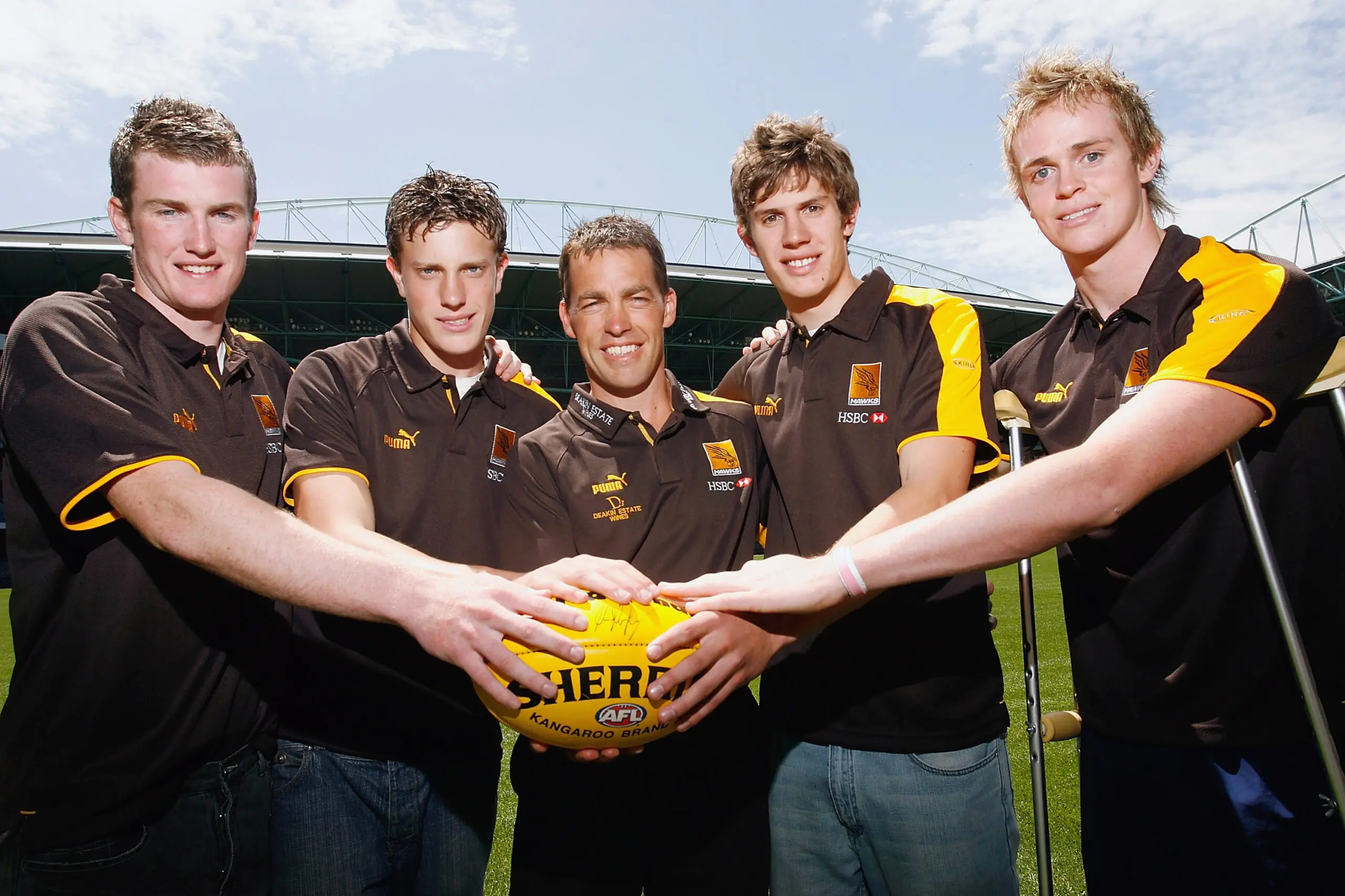
The Hawks will don a commemorative logo for the 2025 season to celebrate their 100th year in the competition.
Melbourne - 2016
The Demons are no strangers to a redesign, having used four different logos since 2004.
Their present-day navy crest with a red MFC monogram and 'Melbourne' text is a basic logo in comparison to their emblem previous, although it doesn't beat its 2008-10 design for simplicity.
Melbourne's logo between 2011-2015 was the opposite of simple. It consisted of a shield-shaped border, with a monogram in the red V, a pitchfork on the left side, a football in the middle and the Southern Cross star formation on the right.
White script text runs along the background of the shield too, whilst the establishing date of 1858 and 'Melbourne' are along the bottom and beneath the shield. The complex logo was replaced in 2016 as the club aimed to amalgamate its history and its aims for the future in a timeless-looking logo - and hence the current edition was born.
North Melbourne - 2017
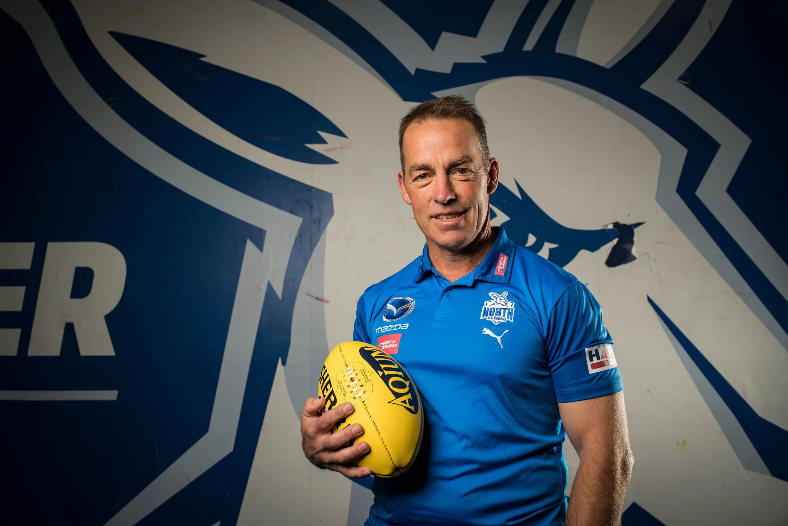
The Kangaroos deliberately reincorporated the 'North Melbourne' name back into their redesigned logo in 2017. The version used between 2007 and 2016 predominantly highlighted the Kangaroo moniker underneath an image of a kangaroo with a silver football against a shield-shaped background.
The present logo now has a more menacing look to the Kangaroo, with larger text emphasising North Melbourne's location. The Roos have also reincorporated the bounding Roo from the late 1990s and early 2000s into their clash guernseys recently too, paying homage to the premierships of 1996 and 1999 and logos used between 1985 and 2006.
Port Adelaide - 2019
In 2019, the Power changed their logo from the classic fist and lightning bolt that branded them since their AFL inception in 1997 to a monogram look that ties in their SANFL heritage.
The current logo includes a PA monogram and prison bars design on a black shield with teal and white detailing.
The previous logo was rectangular, with white 'Power' text across the top, while the teal and prison bar elements were separated by a silver fist clenching a lightning bolt. The previous edition was fortunate enough to be branded across the MCG 50-metre arc in the 2004 and 2007 Grand Finals, whilst the current edition has not yet reached the final Saturday in September.
Richmond - 2012
The Tigers rebranded in the early 2010s, creating a logo of a tall and confident-looking Tiger in a shield-shaped background. The logo is sharper and slightly simpler than the logo used between 1995 and 2011, which was a detailed yellow and black Tiger head in a circular logo.
The previous logo was used for effectively 16 years, with minor adjustments made in 2001. The Tigers also made adjustments to their guernsey in 2017, opting for a brighter yellow and deeper black to enhance their yellow and black identity, straying away from the "charcoal and mustard" look that had crept in.
St Kilda - 1994
It's been a long time since the Saints have rebranded - and it looks like their time has come. St Kilda are set to change its logo for 2025, over 30 years since their latest redesign.
Previous to their current emblem, the Saints incorporated their famous Stickman leaping for a mark. Additionally, the classic shield logo had four goalposts as well as a smaller version of the current St Kilda logo inside the shield.
Sydney - 2020
The Swans rebranded in 2020, depicting a larger Swan with greater detail inside a red V to symbolise their connection to South Melbourne. The previous Swans logo similarly used a red V, however the Swan was smaller in size and the logo incorporated an outline of the Sydney Opera House, likewise to the style of the Swans guernsey.
Sydney's previous logo also had 'Sydney Swans' written in a black font above the logo, whilst the club's new logo has dropped the Swans nickname and turned the text to the same shade of red as the imagery.
Sydney's prior emblem was used since 1997, featuring in two premierships and three runners-up appearances in that time.
West Coast - 2018
The Eagles went under a cultural revamp in 2018, slightly altering the colours of their team when rebranding their logo and guernsey.
West Coast's current logo uses royal blue and gold in a similar side-on bird as Hawthorn and the former Crows emblems used. The previous logo consisted of a longer, navy eagle with orange and gold detailing, as well as spaced-out text.
Additionally, in the 2018 rebrand, the Eagles turned back the clock to their 1990s royal blue colour scheme for their home jumper, whilst their clash kit reflected the yellow-based guernsey of the 1980s.
Until 2018, West Coast's home guernseys were navy blue, varying throughout the years between wings and panel designs, albeit always maintaining a central Eagles logo.

Western Bulldogs - 2015
The Bulldogs implemented a shield-style emblem in 2015, reflecting their guernsey design with the red and white hoops over a blue base, with a full-body bulldog at the forefront of the logo.
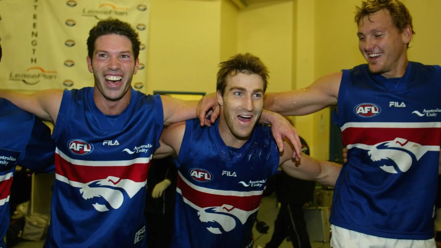
It replaced what is now an iconic design known as the 'Robo-Dog', which was on the Bulldogs' oval-shaped logo between 1999 and 2014. The 'Robo-Dog' logo effectively was a zoomed-in look at a typical Bulldogs home guernsey, with the red hoop and thin white pinstripe separating the blue base on the 'Robo-Dog' jumpers.
The Bulldogs turned to their traditional hoops in 2012, and just three years later the club would rebrand to adjust their logo to match the current guernsey design still worn in 2024.

